
Cycle Norway
Designing Onboarding & Stay Options for Cycle Norway App
DURATION
1 week
YEAR
2024
ROLE
UI designer
PROJECT
Module assignment brief
about
Cycle Norway
Cycle Norway provides resources, routes, and tips to help cyclists safely explore Norway’s landscapes. They inspire adventures and support cycling enthusiasts with practical advice and community events. In this task, I had to make an Android app based on the content of their website, designing two templates for their app:
- Onboarding screen template
- Accommodation screen template
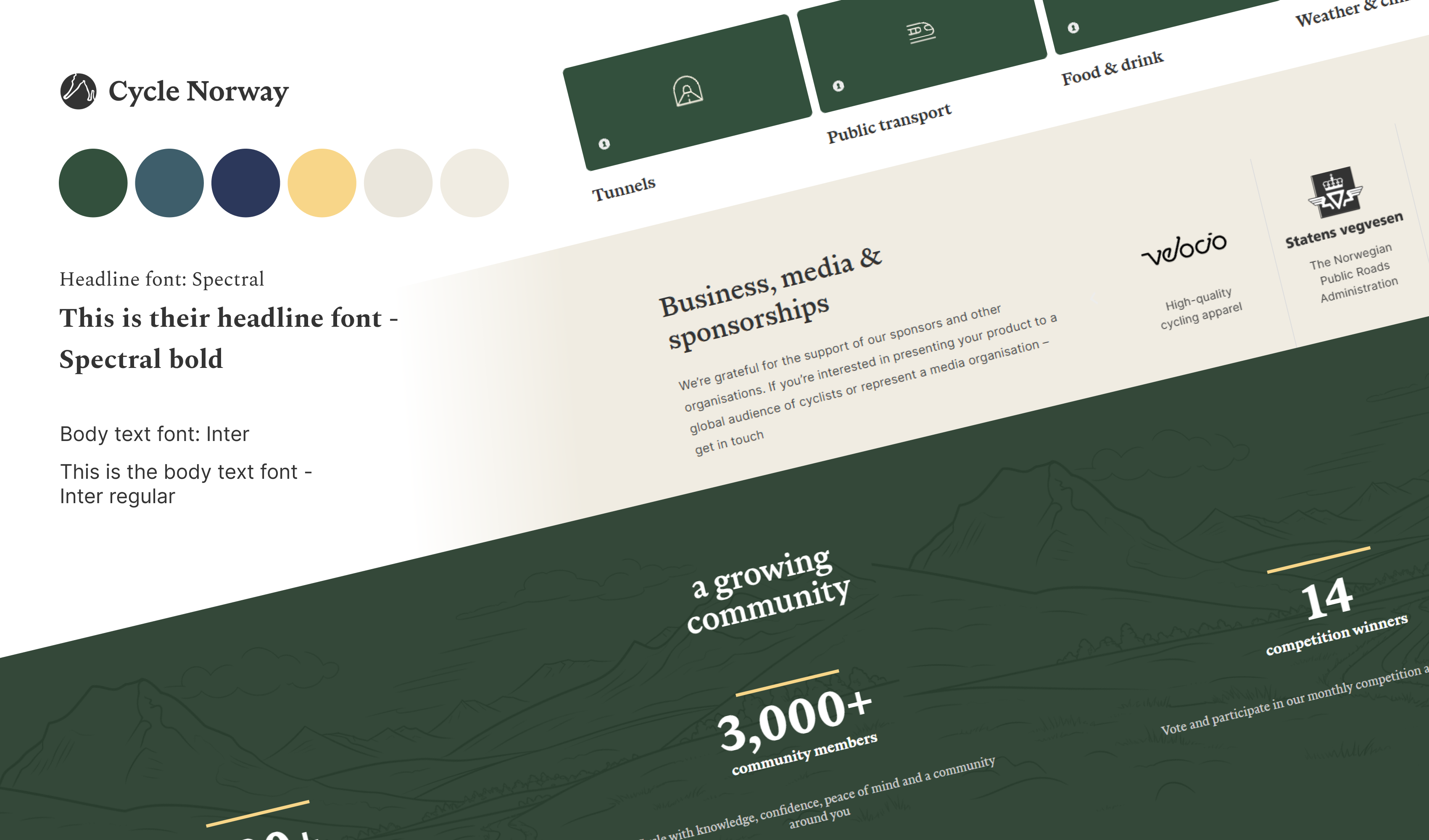
Task
What to include
Onboarding Screen
- 1-3 screens
- Image/illustrations
- Skip button/link
- Next button/link
- Dot navigation styles
accommodation Screen
- Show three options:
- Campsite
- Mountain Cabin
- Hotel
- Heading/name of accommodation
- Hero/main image of accommodation
- Other images to showcase the accommodation
- Relevant text about the accommodation
onboarding screen
Ideas
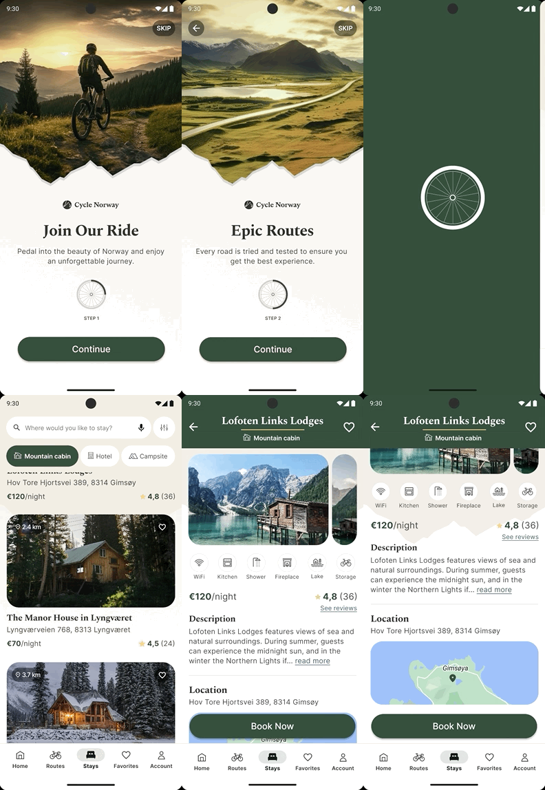
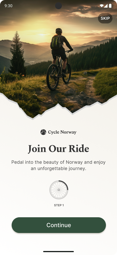
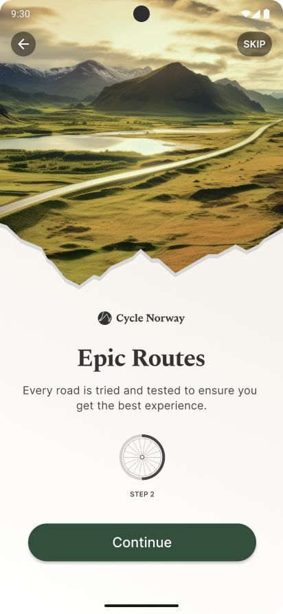
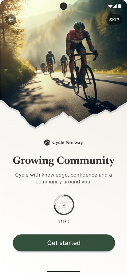
Use engaging pictures to capture attention. Incorporate patterns and illustrations reflecting the brand’s vision, like a mountain-shaped image or a bicycle wheel-style dot navigation. Add “Step 1” labels for clarity in the onboarding process, paired with motivating text.
Challenges
Consider the optimal placement of “back” and “skip” buttons, and evaluate whether using AI-generated images might impact the perceived trustworthiness of the design.
Solutions
The buttons were placed at the top with a black transparent background, making them visible without cluttering the design. While the images are AI-generated, they align with Cycle Norway’s branding, effectively conveying the desired emotions. Real images will replace them in the app whenever possible, addressing potential concerns about AI usage.
accommodation screen 1
Ideas
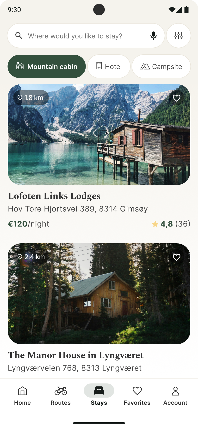
Include a search bar with filtering options and category buttons for efficient navigation. Display key information, distance, and a “Favorite” option under each picture. Add reviews to help users make informed decisions.
Challenges
How big should each section be to give enough information but also not take too much space on the page
Solution
After some research, I found better size recommendations for each element. For example, buttons on Android are advised to be no smaller than 48×48 px
accommodation screen 2
Ideas
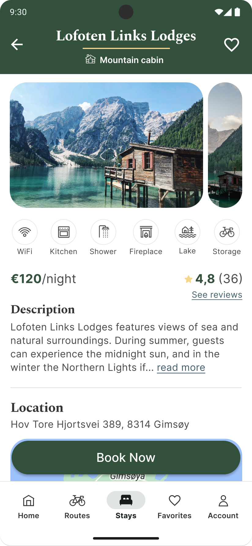
Use an image carousel and add labels with icons and text for better understanding. Include a collapsible description section to avoid overwhelming users with text. Display the address, along with a map, to help users visualize the location and nearby attractions. Ensure a clear “Book Now” button is prominently featured.
Challenges
I wanted to use the image carousel from Material Design Guideline, but found the animation difficult to manage while scrolling on page also was enabled
Solution
I made my own animation that kept the scrolling working and still kept the main look of the image carousel
Lessons Learned
Essentials of Onboarding
I have learned which elements are an important part of onboarding screens, for example skip, back or next-button, dot navigation and illustration/image.
Understanding Accommodation
Initially, I was unsure about the concept of accommodation, but I’ve come to understand it as essential needs and learned how to design an application around it while ensuring strong usability and accessibility.
Use of Material Design 3
When making design for Android or iOS, it’s important to use design elements from their design systems to keep consistency between the device and application.
Other Projects
Nor Møbler
UI DESIGN
Animal Rescue
UI/UX DESIGN, BRAND IDENTITY DESIGN