DURATION
1 week
YEAR
2024
ROLE
UI/UX designer & brand identity designer
PROJECT
Exam project
GRADE
A
About
Høydepunkt Arrangementsservice AS
Høydepunkt Arrangementsservice AS is an event agency in the Stavanger region, organizing over 250 events annually. They didn’t have an app for their brand yet, so I decided to take on the challenge and design one as my exam project. Overall in this task, I had to create
- New branding, including logo, color theme, typography etc.
- Brand guide
- Android application (1-3 steps)
- Design system
I also conducted usability testing on the application and created a report to present the findings.

Challenge
How can I design an app that balances professionalism and engagement to effectively drive users toward our objective?
Key Objective
Showcase Høydepunkt’s offers and motivate the user to submit a request
Solution
A clear and straightforward design with a well-chosen color palette and complementary visuals
step 1
Branding, Sketching and Prototyping
Brand Guide
- Cover
- Logo
- Colors
- Imagery
- Typography
SKETCHES and HIGH fidelity PROTOTYPE
- Homepage
- All Offers
- Specific Offer Page
- Menu
Brand Guide Creation
By working on this guide simultaneously with the app design and design system, it became easier to align the design elements.
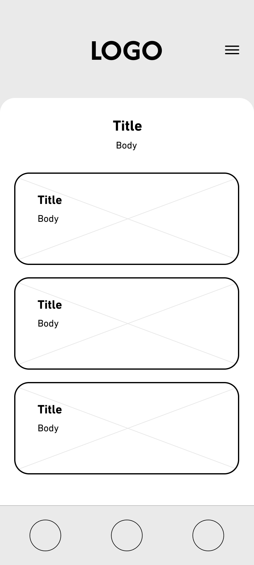
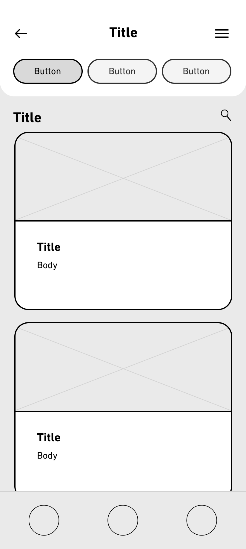
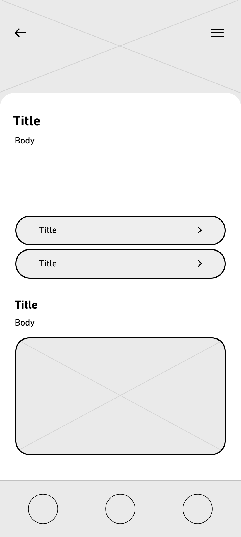
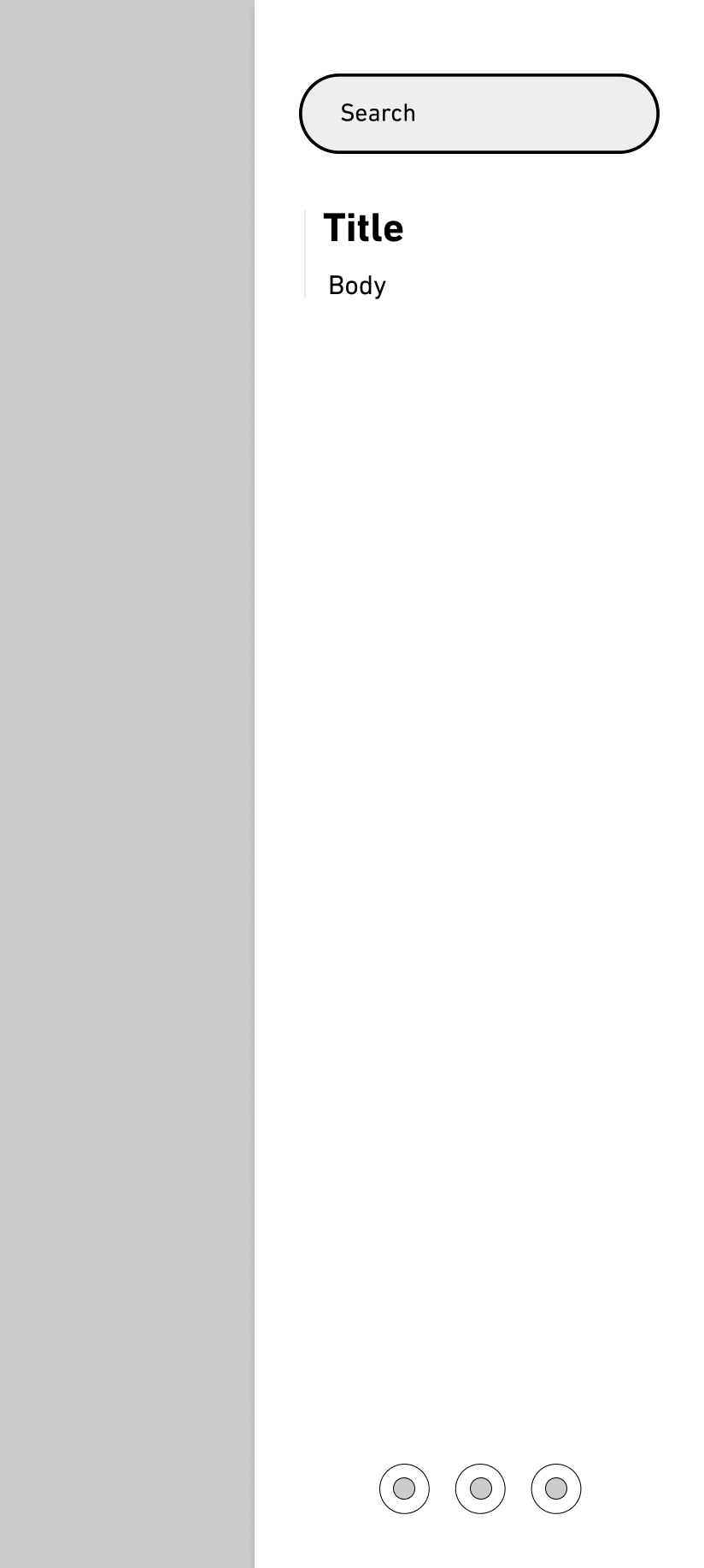
Low Fidelity Sketches
I created low-fidelity sketches for my application to quickly visualize key design concepts, focusing on layout, structure, and user flow without getting distracted by details.
High Fidelity Prototype
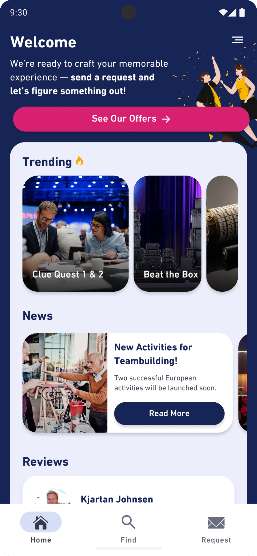
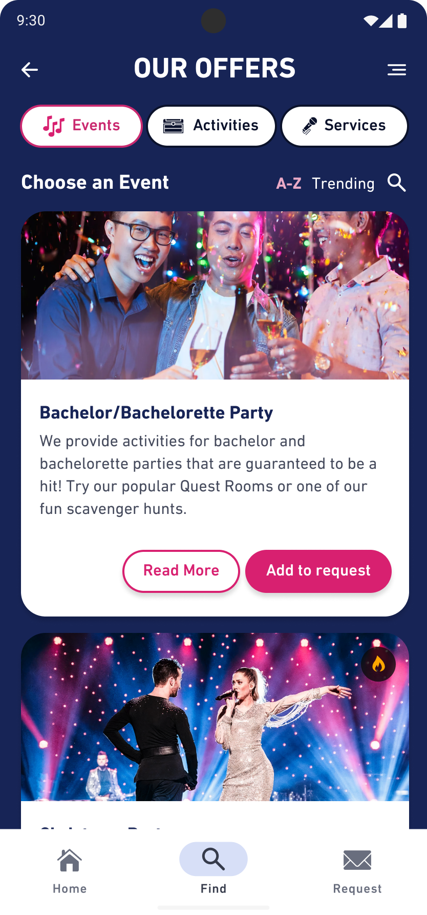
First draft
Homepage
A clear CTA with a description was added to guide users effectively to their destination, along with elements showcasing popular offers, recent activities, and reviews for added insights.
“Our Offers” page
Clear cards display the offers, with options to read more or add to a request instantly. A sorting feature by A-Z or trending was added to enhance usability and effectiveness.
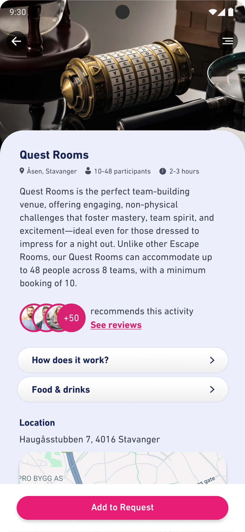
Specific offer page
Simple but showing the most important parts of the activity, with accordion options to read even more
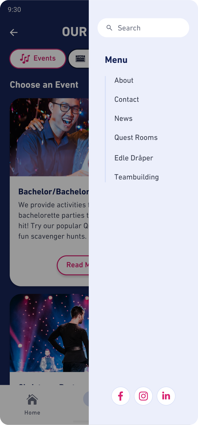
Menu
Direct and focused, with minimal distractions. Designed to showcase additional pages that were difficult to fit elsewhere in the app
step 2
Usability Testing and Design System Creation
Usability Testing
- Plan for testing
- Run testing sessions
- Analyze and synthesize data
- Compile testing details and findings
- Write a report
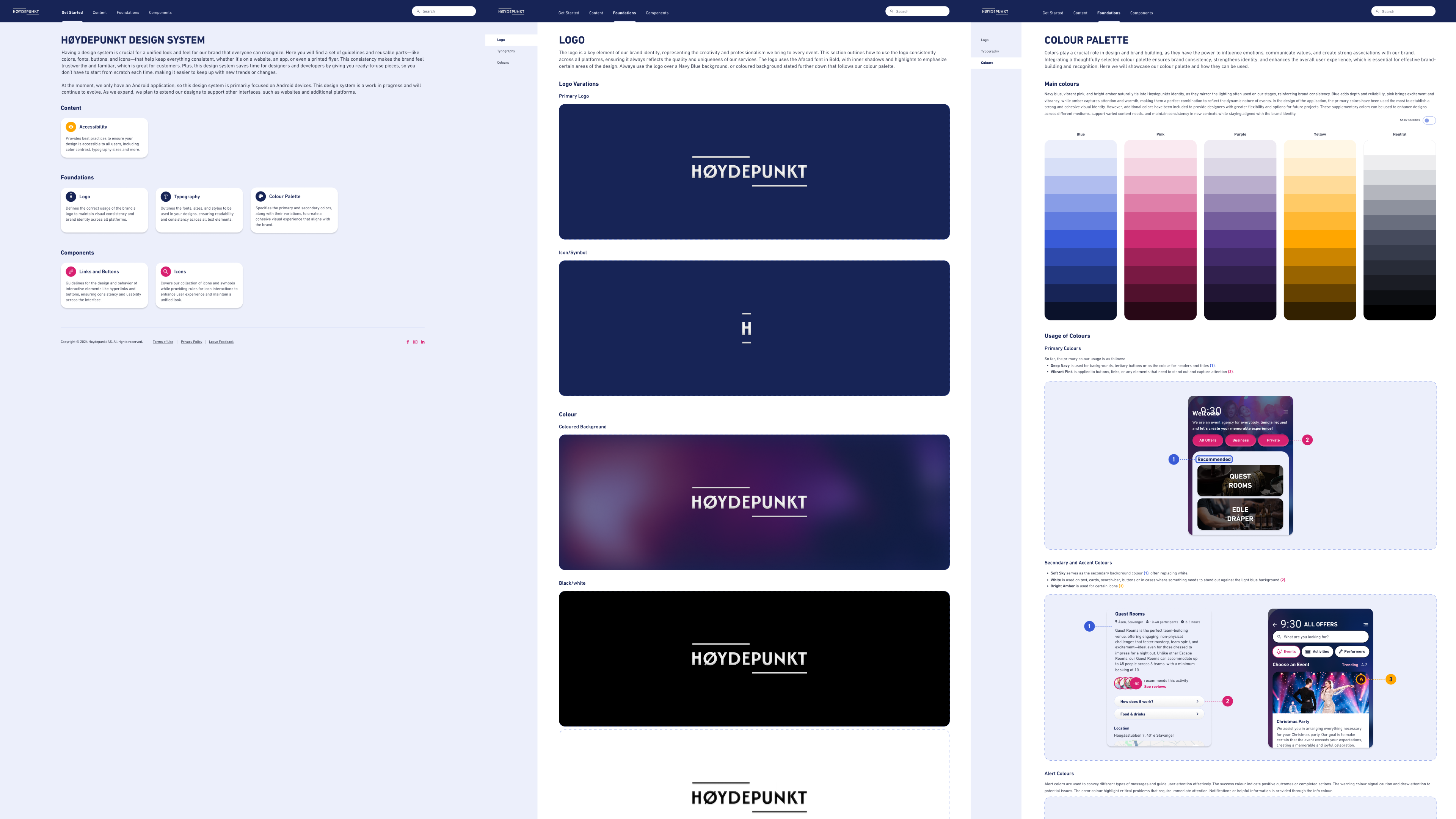
Design System
- Introduction
- Logo
- Color palette
- Typography
- Links and buttons
- Interactions (icons)
Usability testing
Goal
- Accomplish the task within 2 minutes
- Task: Imagine you are celebrating your birthday and want to make the celebration special with an activity from Høydepunkt called Quest Rooms. Your task is to find Quest Rooms in the application and add it to your request.
- 80-90% task success rate
Findings
- 20% complete task success rate
- 80% complete task success rate with minor issues
- Rather than navigating to “Offers” and “Activities,” they remained on the “Events” page until they realized their goal couldn’t be achieved there, leading them to click on “Activities” eventually.
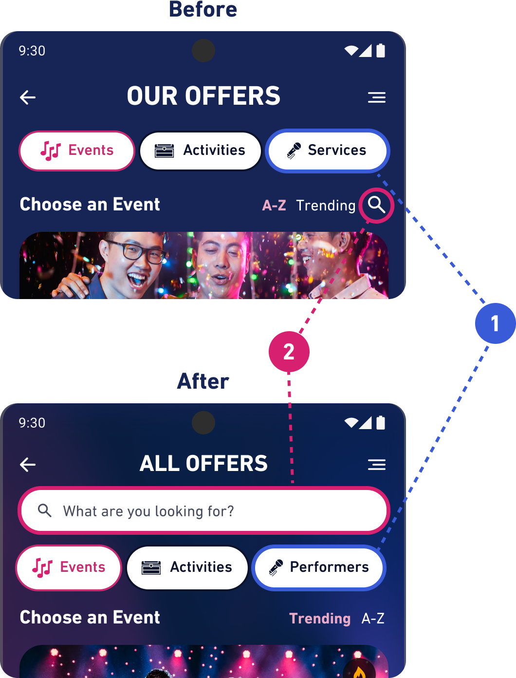
Problem 1: Labels
- Difficulties understanding the difference between events, activities and services
- Solution: The labels were updated for clarity (1), and a search bar was added at the top of the page to improve navigation and align with user expectations, replacing the search icon to make finding items more intuitive (2).
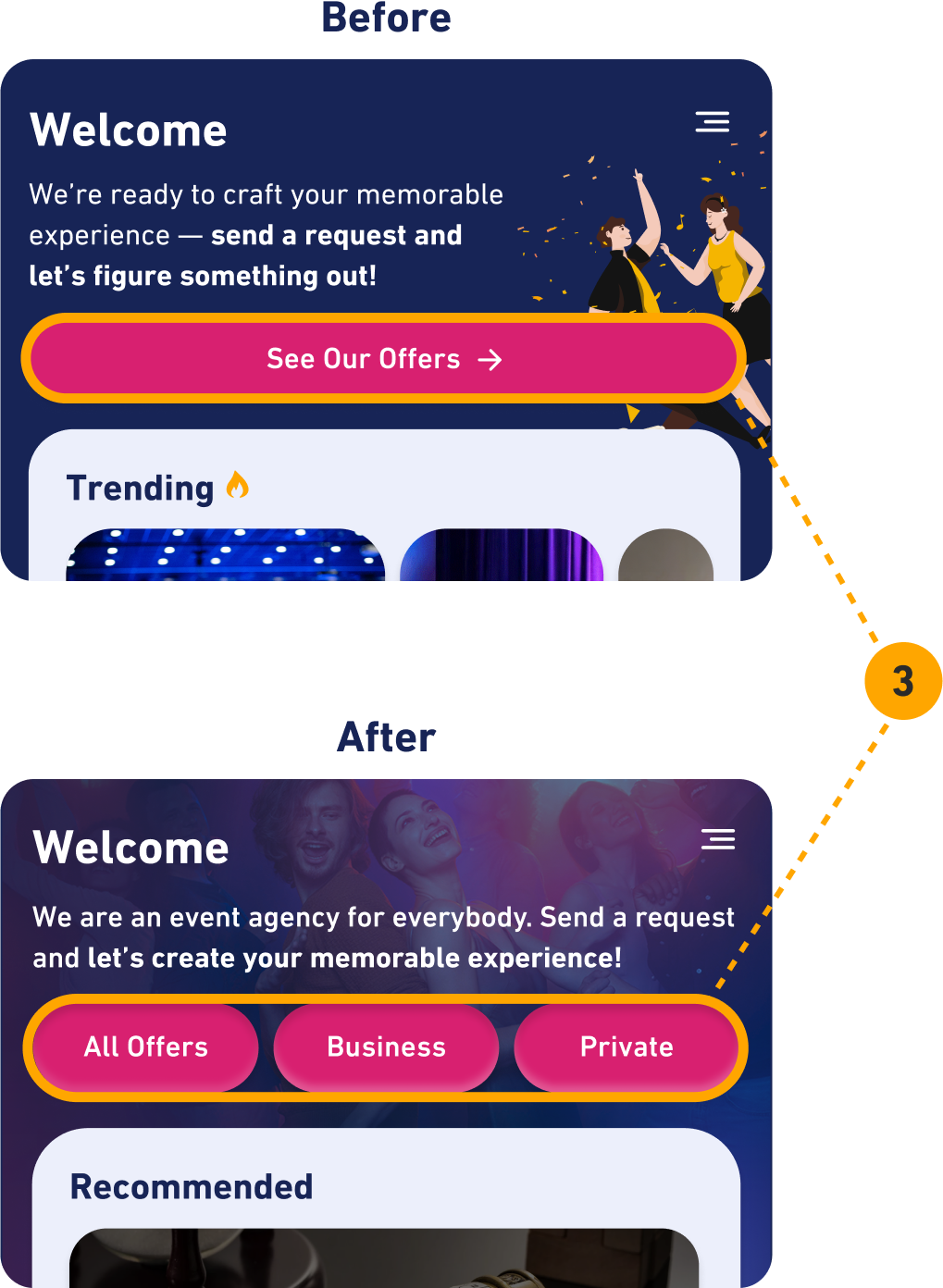
Problem 2: Categorization
- Participants highlighted the need for clearer distinctions between business and private offers to improve search efficiency.
- Solution: Split all offers into three extra categories, which can be chosen on the home-page: “All Offers”, “Business” and “Private” (3)
Problem 3: Homepage and First Impression
- Homepage appeared somewhat cluttered, could be better organized
- Trending was bugged and could not be swiped properly
Want more details? See the report here
Sitemap
This sitemap highlights some categories and navigation paths designed for this app after usability research was conducted.

Finished Product
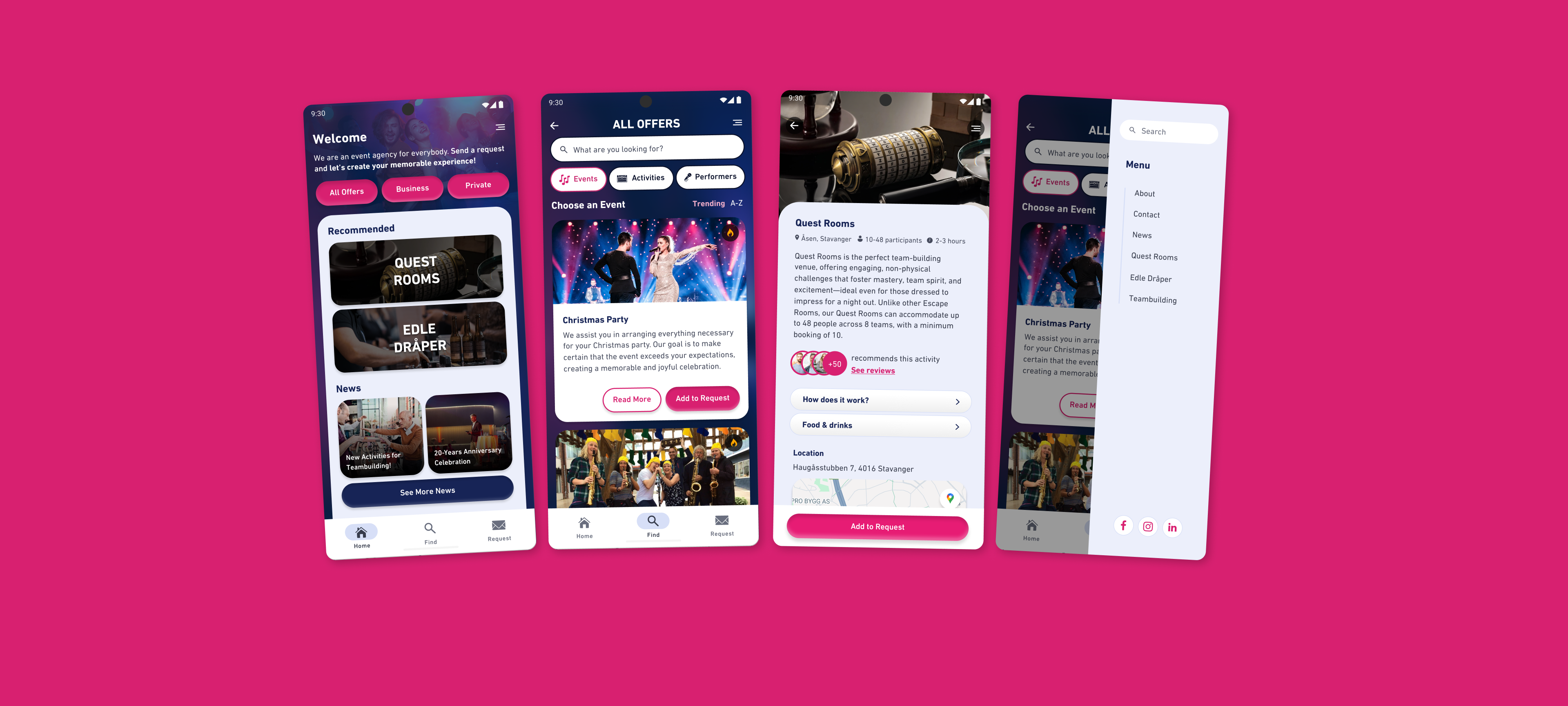
check it out
Design System
Note: Interactions are not included, as they were not part of the task.
Lessons Learned
More Research
I’ve learned the importance of conducting more thorough research before starting the design process to gain a deeper understanding of the target audience.
Creating Balanced Design
I’ve learned how to balance creating designs that are both engaging and action-inspiring while maintaining a professional tone to appeal to a corporate audience, which was their primary target group. This is done through the right use of visual elements, tone of voice and thoughtful layout choices.
Efficient User Testing
Testing the design is essential for understanding how users will interact with the application in real-life scenarios, and I have learned the most effective ways to conduct this process for the project’s benefit.


