DURATION
1 week
YEAR
2024
ROLE
UI designer
PROJECT
Module assignment brief
about
NOR MØBLER
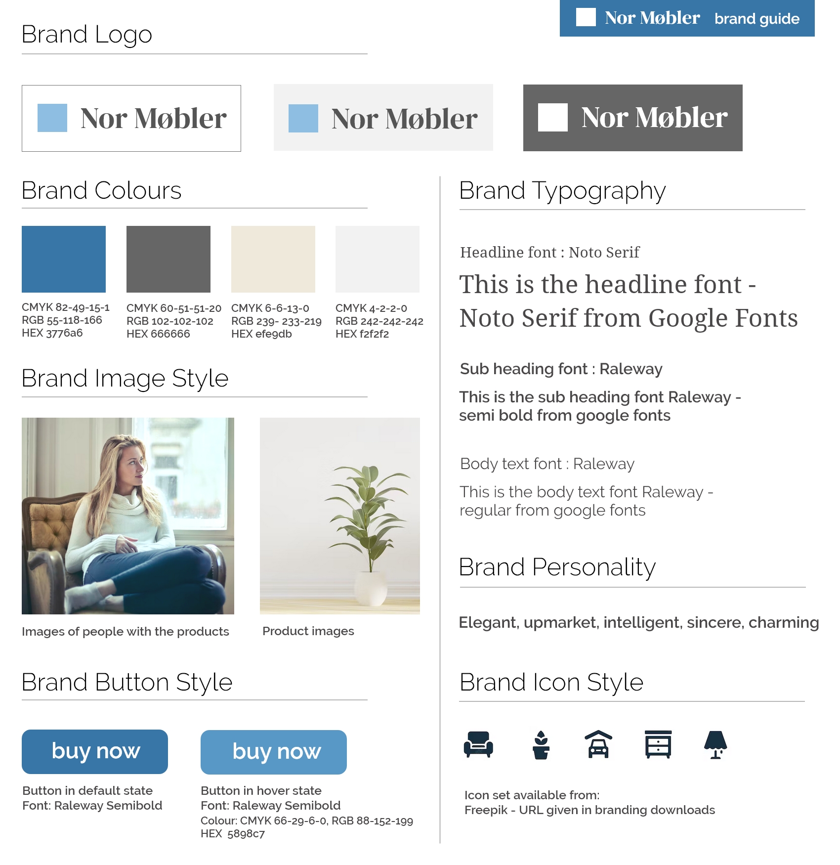
Nor Møbler is a fictional Norwegian company selling furniture and home décor items online. This task was a school project focusing on adding an online shopping offering to the existing basic website, by creating a landing page, e-commerce page and dashboard.
TASK
What to include
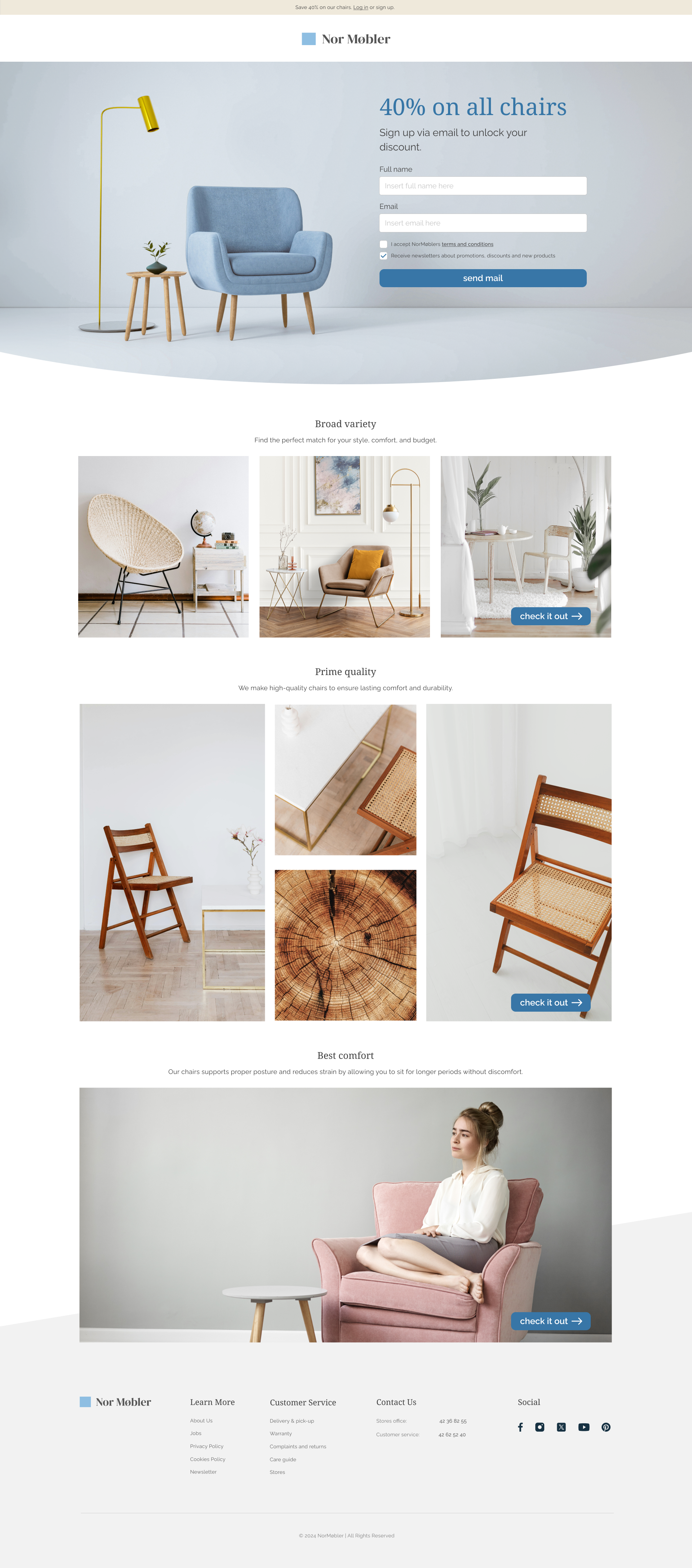
Landing Page
- Company logo and branding
- Product images
- Form with fields to capture customer information
- Checkbox for user consent
- A clear call to action
E-commerce Page
- Product name
- Product description
- Product price
- Any options for products, f. ex. sizes and/or colors
- Key features of a webpage selling products
Dashboard
- Sales revenue per week
- Sales revenue per month
- List of popular products
- Average daily orders
- Deliveries per month
landing page
Ideas
Keep it clean and elegant with clear visuals, attention-grabbing titles and buttons in distinct colors, inspiring pictures, and concise descriptions for simplicity.
Challenges
Finding a simple header image which followed the brand guideline while also tempting the visitor to take action.
Solution
Use the header title to help with tempting visitor to take action.
focus points
Simplicity
Creates clarity, usability, and a focused user experience.
Elegance
Elegancy balances sophistication with functionality, and is part of the brands personality.
Informative
Ensures users can quickly access and understand key details.
E-commerce page
Ideas
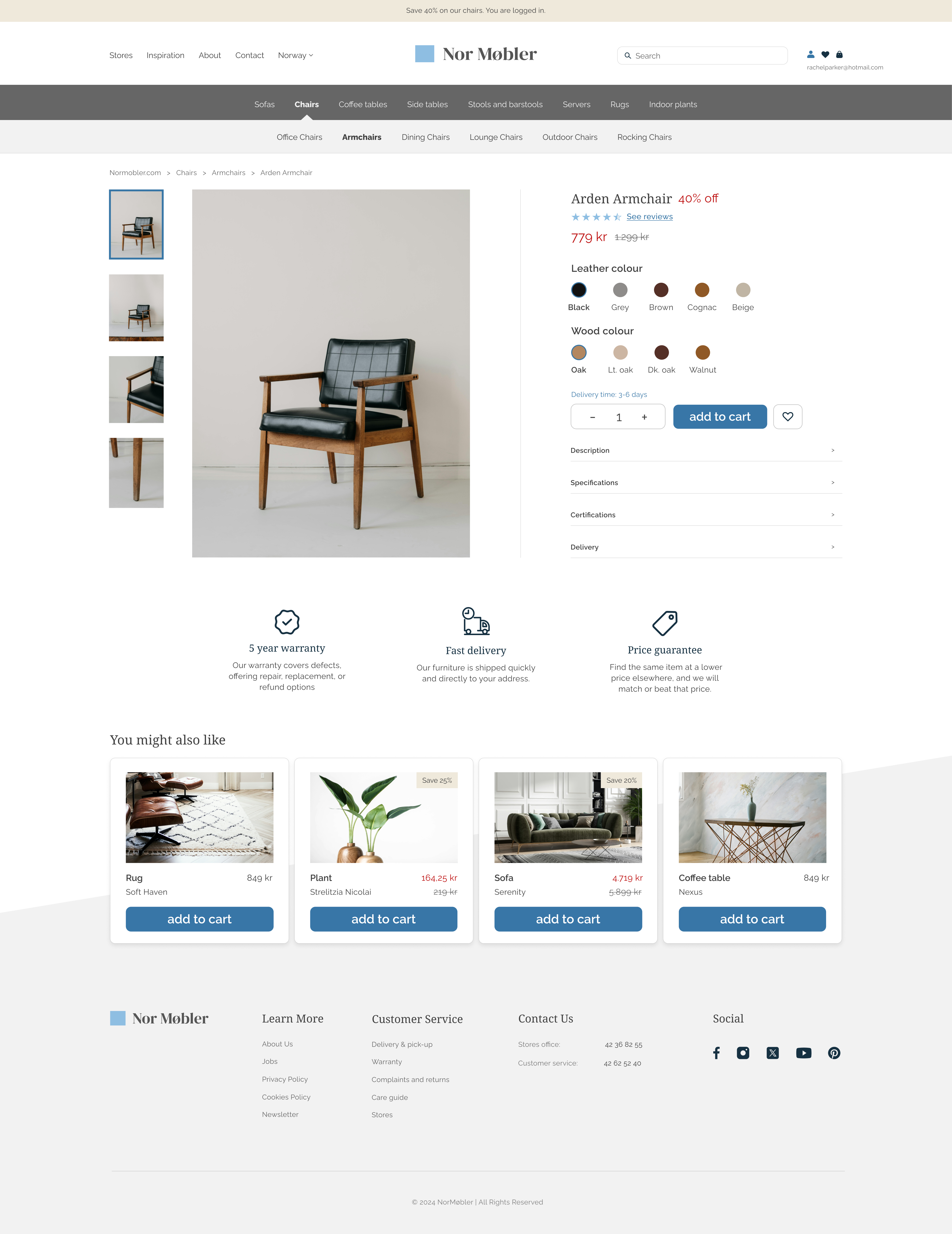
Use breadcrumbs for easier navigation, simple image variations, and a “Like” option for usability. Keep information clear with optional details and suggest related products to boost add-on sales.
Challenges
How discounts and important information should look visually, as I wanted them to stand out but still follow the focus of elegancy and simplicity.
Solution
Kept the important information in red to clearly stand out from the rest, but decided to keep it in regular weight to stay consistent with the brands personality.
Dashboard
Ideas
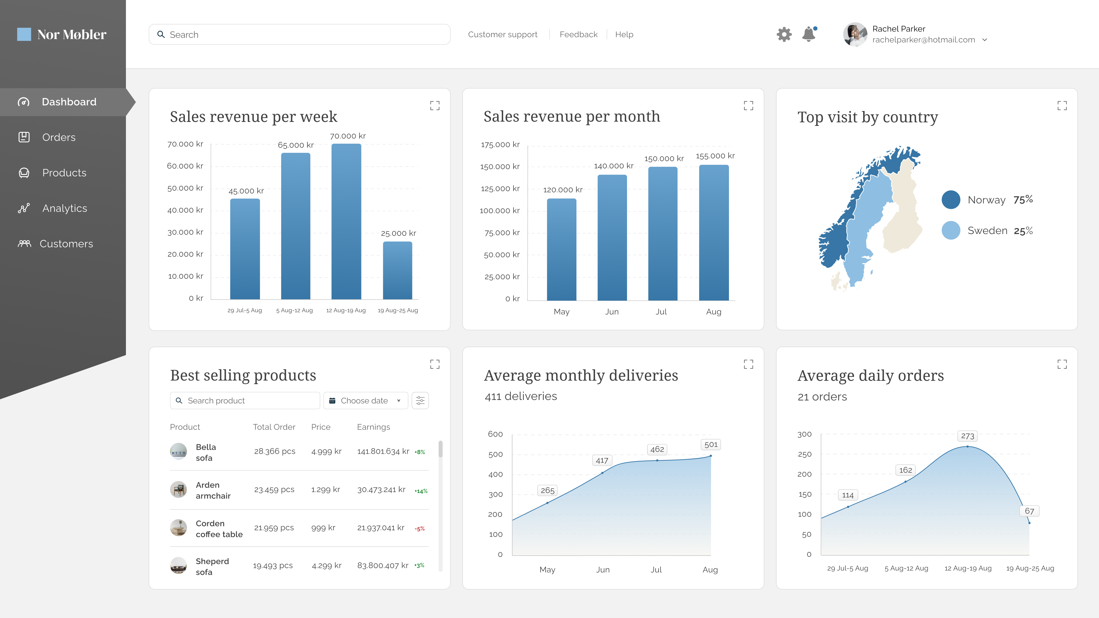
Continue same theme as the brand guide and webpage – simple and elegant.
Challenges
Font size for optimized accessibility.
Solutions
Keep text big enough where possible, and option to show each section in full size.
Lessons Learned
Necessary Elements for Landing Page
I have learned what elements are necessary (and not necessary) when making a landing page, and that it should stay simple to drag attention towards the right places.
How to Make a Dashboard
When designing a dashboard, the information given needs to be clear and easy to understand.
